EngineeringLive2025
OKLCH Palette Generator
A tool that anchors to one reference colour and generates full, perceptually uniform colour scales.
Adopted by Kinesis for primitive colour creation in the Nebula; shipped in days.
Live at oklch-palettes-generator.lovable.app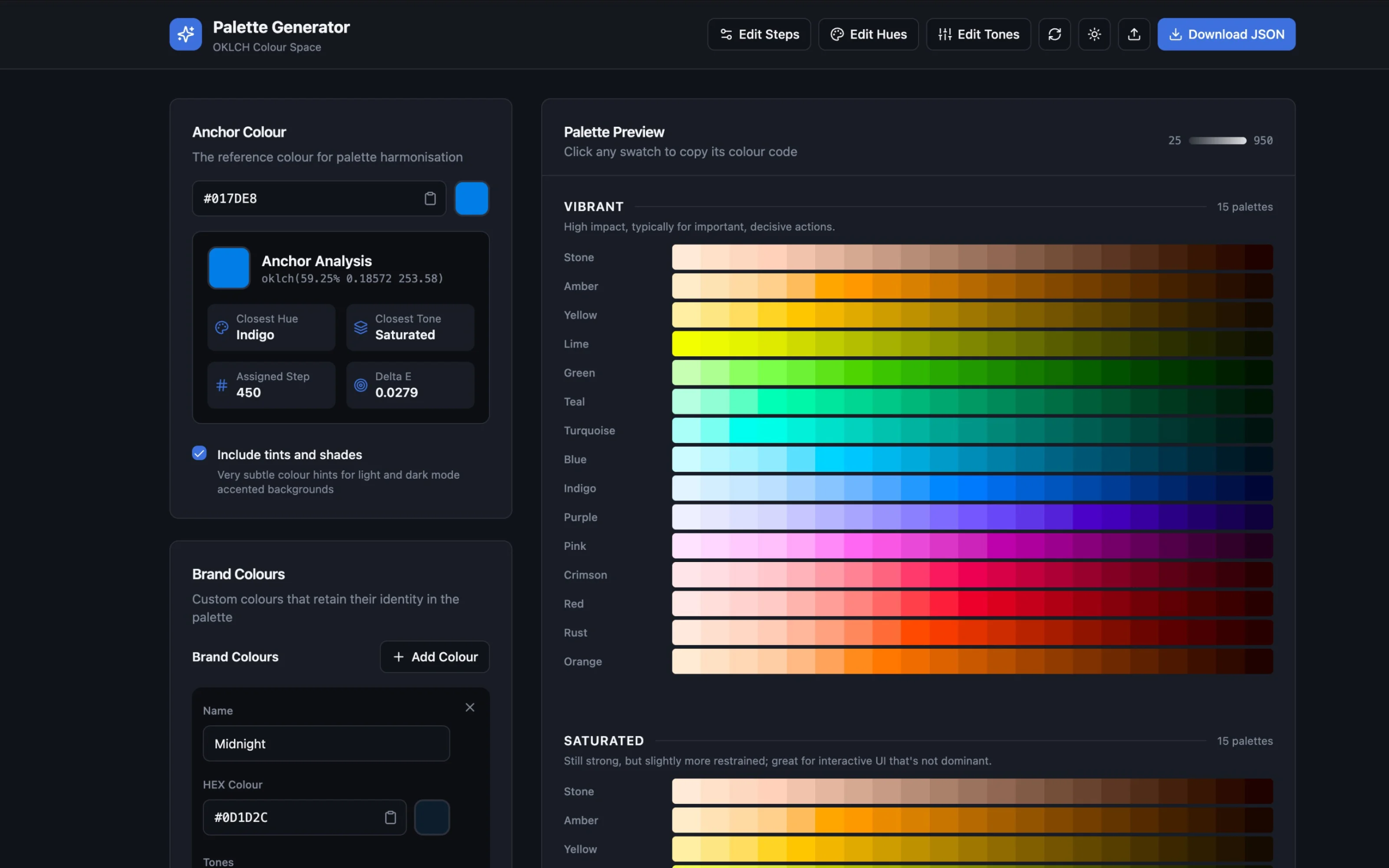
TL;DR
01 / What it is
A web tool that takes one reference colour and generates complete, perceptually even colour scales, with your brand colours kept intact.
02 / Why it existed
Mapping colour steps by hand takes weeks of trial and error. This does it in minutes, and you do not need to understand OKLCH to use it.
03 / What I achieved
Adopted by Kinesis for the Nebula's primitives, reused for ClubHost, and built in days with AI-assisted development.
- palettes in a single generation
- 97
- colours from one anchor
- 2,037
Overview
You give the generator one anchor colour and it produces full colour scales across configurable steps, hues and tones. It works in OKLCH, a colour space where equal steps look equal to the eye, which is what makes the scales usable for accessible UI. It places your anchor on the hue wheel, gives it a tone and a step, lets you add brand colours that keep their identity, and exports JSON that imports straight into Figma as variables.
Why it existed
Building colour scales by hand in OKLCH is slow. A 21-step vibrant red means working out the lightness ramp, holding the chroma at the edge of what screens can show, and checking every step looks evenly spaced. Then the saturated, muted, pastel, tinted and shaded versions. Then fifteen hues. Without a tool it is weeks of spreadsheets and plugins.
I built it during the colour alignment project across the Kinesis web and app platforms, where the team was stuck on dark-mode palettes that kept the brand's vibrancy. Mixing black and white into a brand colour goes muddy. OKLCH does not, because its lightness is perceptual rather than additive.
My role
I designed and built it. I worked out the colour-space logic, the palette calculations and the gamut-mapping fix, and designed a UI that lets designers tune steps without breaking brand hue relationships. Built with AI-assisted development on Lovable.
Approach
Engineering
Engineering
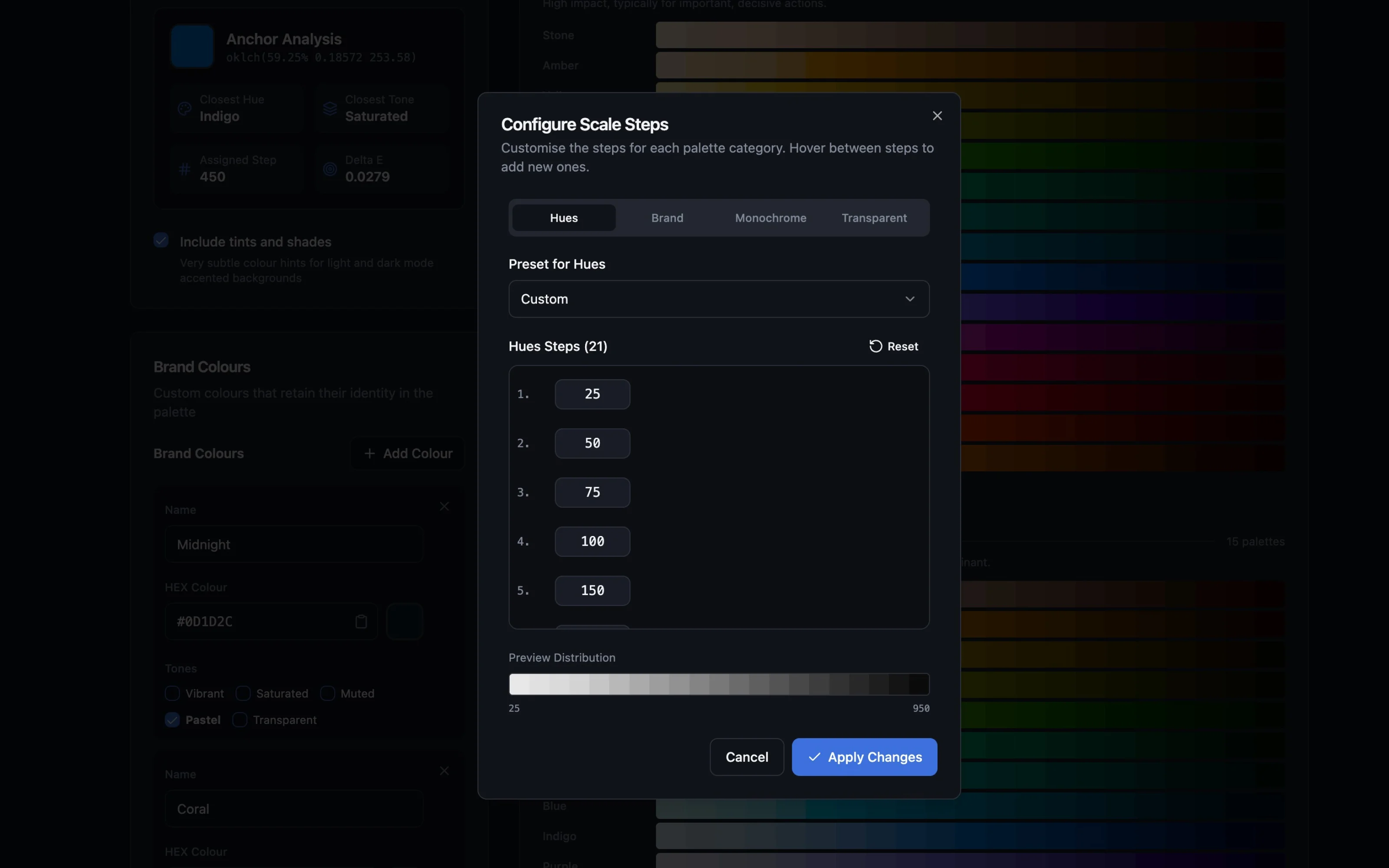
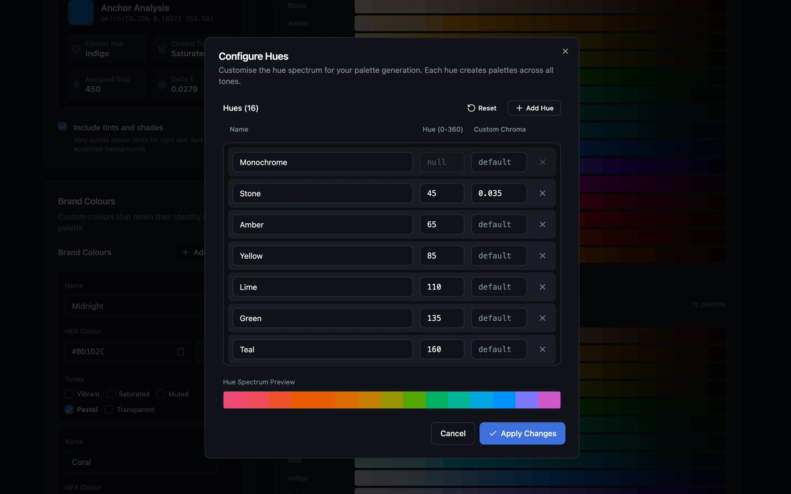
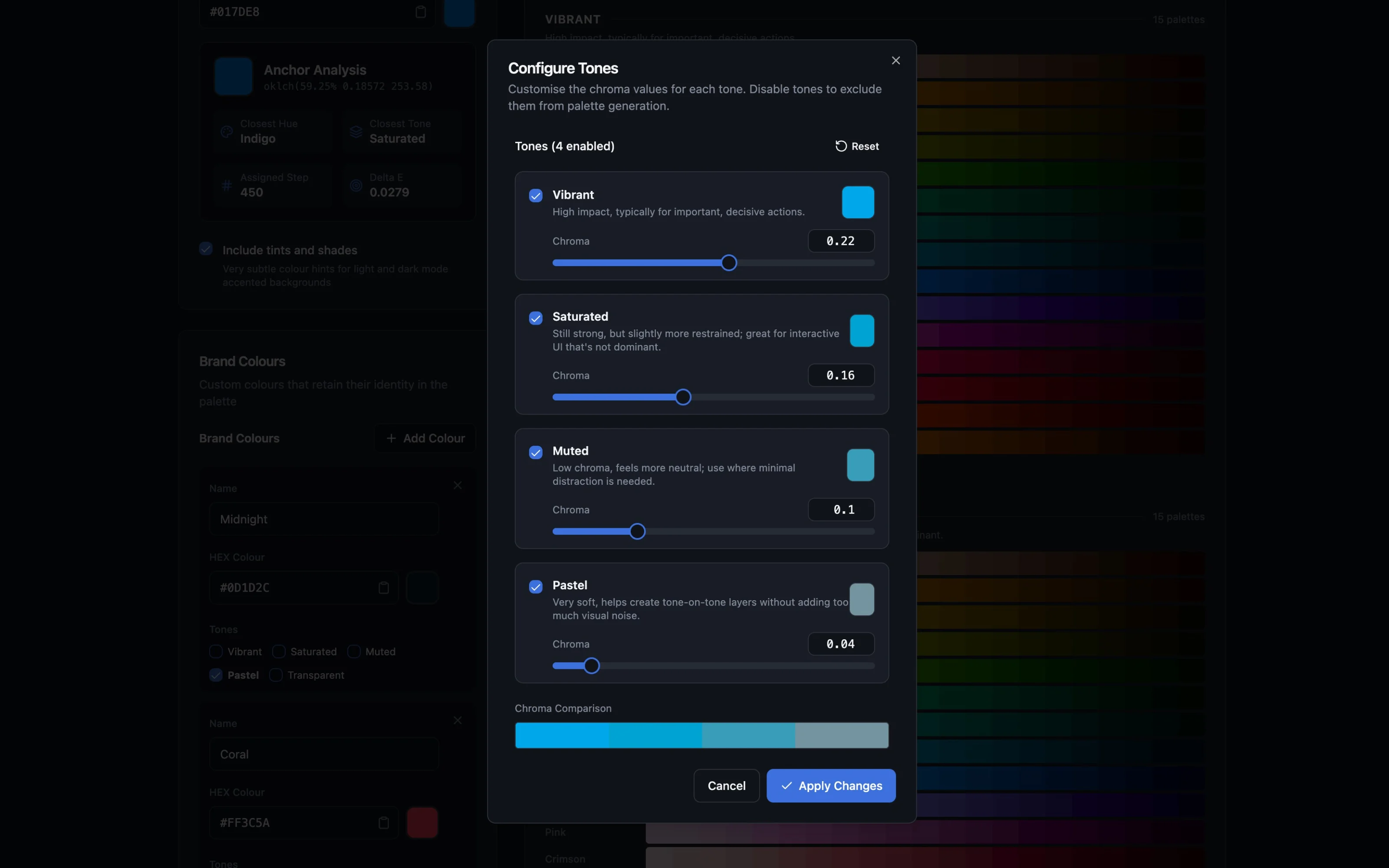
The generator uses colorjs.io for the colour-space maths. The core algorithm takes an anchor colour, analyses it against the OKLCH hue wheel to find its closest hue, closest tone and step, then generates palettes across configurable steps (21 by default) and tones: Vibrant, Saturated, Muted, Pastel, Tinted, Shaded, Neutral and Transparent.
The tones are spaced by chroma, the colourfulness axis, in even gaps: Vibrant sits at the ceiling of what screens can display, and each tone below it steps down by the same amount, so the drop from Vibrant to Saturated looks the same as the drop from Saturated to Muted.
The hardest problem was gamut clipping. Asking for a vibrant red produced pink, because the naive way of forcing a colour onto a screen clamps each channel independently and shifts the perceived hue. The fix was perceptual gamut mapping: reduce the chroma until the colour fits, keeping the hue angle exactly where it was. The colour comes out slightly less saturated, but it is the right colour. I applied it across all five generators: hue and tone, monochrome, brand, tinted and shaded.
Brand colours are analysed and placed by their OKLCH position. A vibrant coral lands at step 350; a near-black midnight blue lands at 850. The brand colour keeps its identity in the palette rather than being snapped to the nearest generated step.
Design
Design
The UI exposes decisions, not maths. The anchor colour is a single input. The analysis is shown as read-only context. Brand colours are added by name and hex, and the tool handles the conversion and step assignment. Tones are toggled with a checkbox each; steps and hues have their own edit panels.
The "Include tints and shades" toggle adds two categories: Tinted, near-white surfaces with a trace of the hue for light-mode accented backgrounds, and Shaded, their dark-mode counterparts. These are the subtle hints that solve the muddy dark-mode problem. They are not full tones; they are backgrounds.
The palette preview is the output: a grid of swatches, click any to copy its code. The JSON export matches the SupaPalette plugin's format, so the palettes import directly into Figma as variables.
Key decisions
Decision
Perceptual gamut mapping vs naive channel clamping
- Why
- Clamping shifts the perceived hue: a vibrant red becomes pink because the red channel hits its ceiling before green and blue. Gamut mapping keeps the hue angle and gives up a little saturation instead.
- What it cost
- Slightly more computation per palette, and a dependency on colorjs.io.
Decision
Tinted and Shaded as separate tones vs modifying Pastel
- Why
- Pastel is a full tone. Tints and shades are hints: near-white and near-black surfaces with a trace of the hue. Folding them into Pastel would have conflated two different purposes.
- What it cost
- Two more palette categories to generate and maintain.
Decision
SupaPalette JSON export vs a custom Figma plugin
- Why
- SupaPalette already imports JSON into Figma as variables. A custom plugin would duplicate that work. The generator outputs the right format; the plugin does the import.
- What it cost
- Dependency on that JSON format staying stable.
Highlights
Outcome
- palettes in one generation
- 97
- colours from one anchor
- 2,037
Kinesis adopted it for primitive colour creation in the Nebula. The team stopped guessing colour steps, and a designer who had never heard of OKLCH could produce a consistent, accessible scale in minutes. It became the single source of truth for primitives, and I used it again for the ClubHost design system.
Learnings and what's next
AI-assisted development works best when I own the thinking and the AI owns the typing. I reasoned through the colour space, the tone spacing and the gamut fix; the AI built the UI and wired the generators. Without that split the tool would have been generic.
Next: a view showing which Nebula tokens reference each generated palette, closing the loop from generation to use.