DesignLive2024
The Nebula
A four-tier OKLCH token system spanning 4,250 variables across three Figma files.
Adopted as the single source of truth for web and app at Kinesis.
Under NDA: some details withheld. A full walkthrough is available on request.
TL;DR
01 / What it is
The design-token system at Kinesis: around 4,250 variables across three Figma files, built so engineering can use them directly.
02 / Why it existed
Tokens were inconsistent and unowned. Figma said one thing, production said another, and nothing connected them.
03 / What I achieved
Adopted as the source of truth for web and app, with tooling that makes refactors quick and lets anyone trace a token to its origin.
- variables across three files
- 4,250
Overview
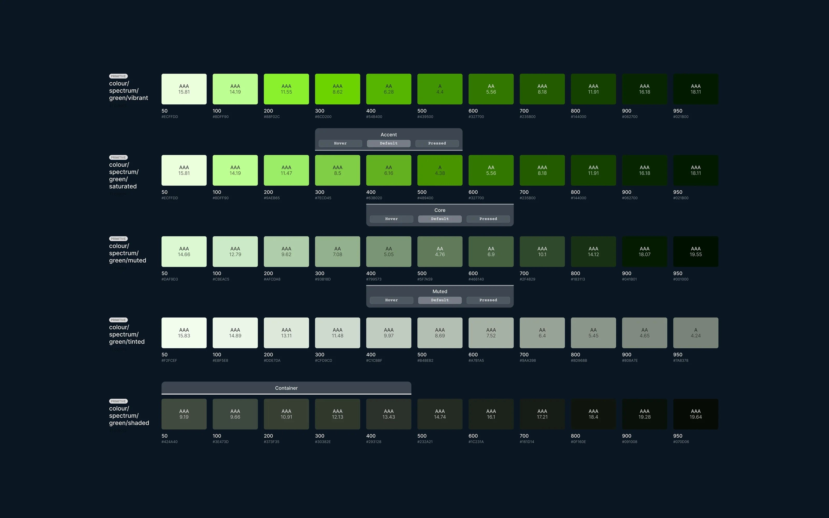
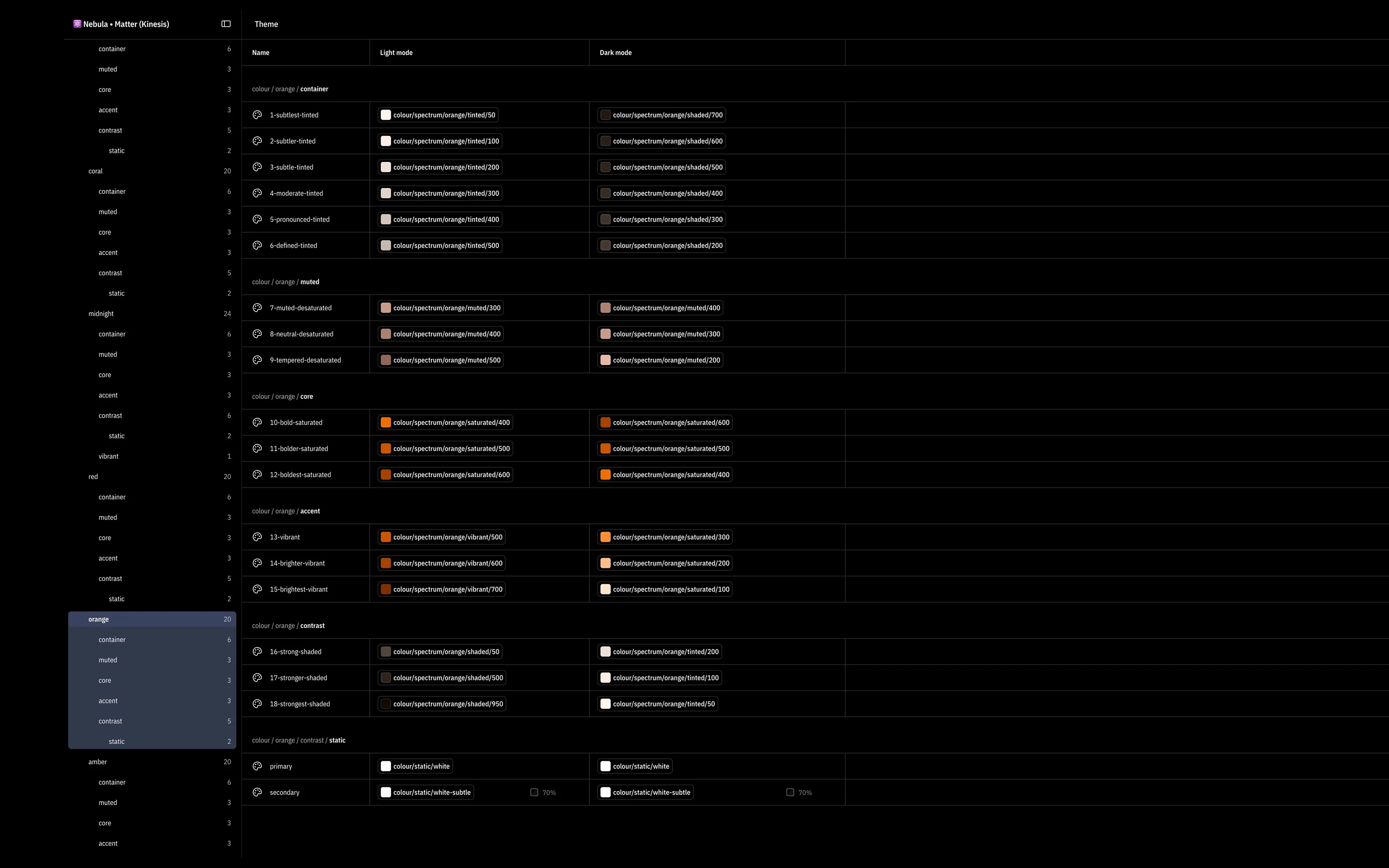
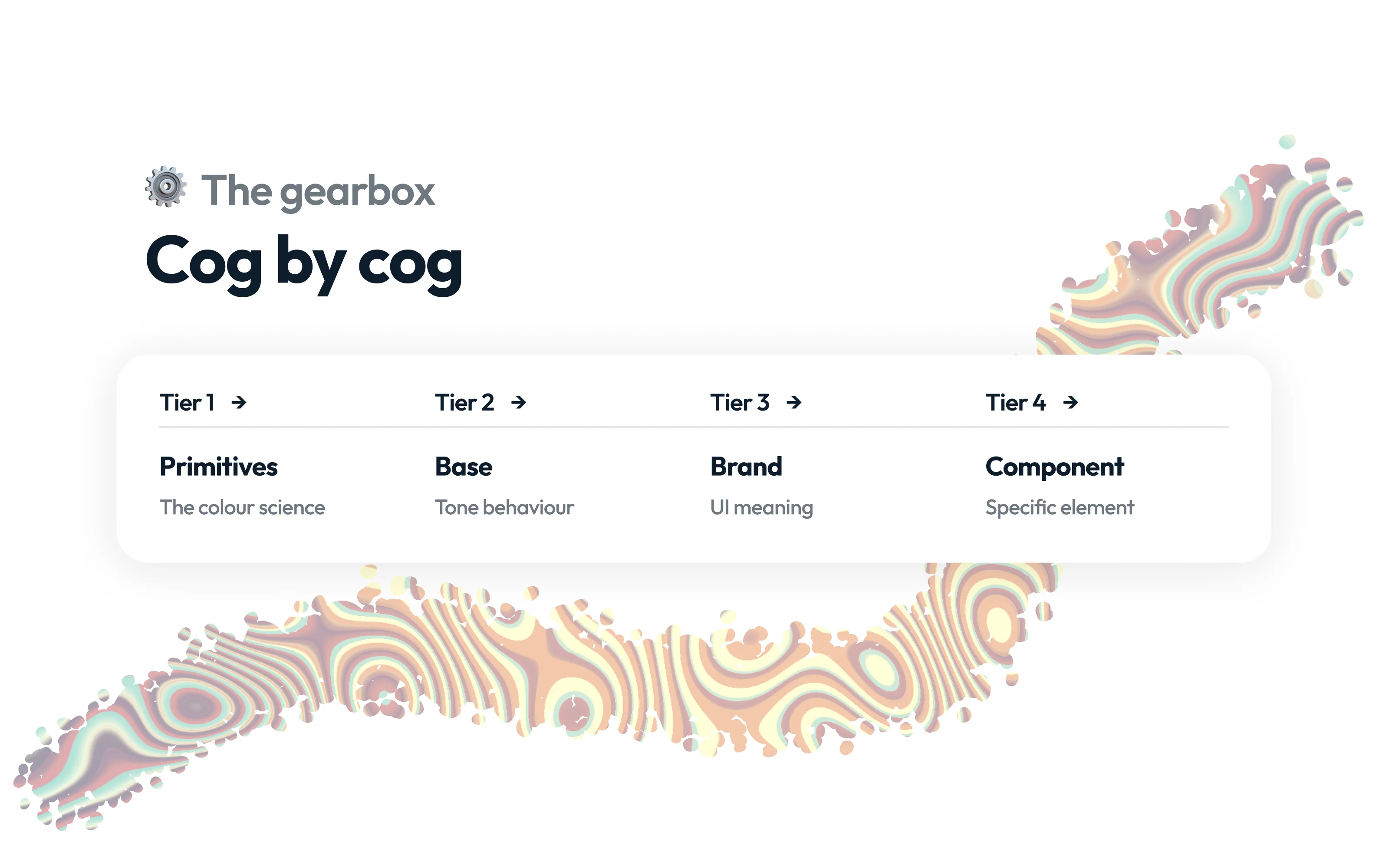
The Nebula is the design-token system at Kinesis: around 4,250 variables across three Figma files, built in OKLCH, a colour space where equal steps look equal to the eye. Tokens sit in four tiers. Primitives are raw values. Theme and platform tiers adapt them per mode and device. The brand tier gives them Kinesis meaning. The component tier is what a button or card actually uses. Engineering maps the Figma variables straight to production across web and app.
Why it existed
Before the Nebula, the K2 design system had a decent component library and messy tokens. A button colour in Figma did not always match the button that shipped. There was nowhere to look up what a token meant, no way to trace a component back to its primitives, and renaming anything meant editing variables one at a time.
At a regulated fintech shipping on three platforms, that is not a cosmetic problem. Every screen depends on the tokens being right.
My role
I architected the Nebula and I maintain it. I designed the four tiers, chose OKLCH, split the files and audited the system for violations. I also built the tooling around it, the batch-update plugin, Nebula Sync and the Token Explorer, so the system runs without me editing variables by hand.
Approach
Design
Design
Each tier has one job, so a change lands in one place and propagates. OKLCH was chosen because a lightness step looks the same whatever the hue, which matters when generating accessible variants across light, dark and four platforms.
The file split mirrors the tiers. Matter holds the foundations, Gravity holds the brand expression, Stars holds the component surface. A brand change lives in one file and propagates, rather than touching dozens of component files.
Engineering
Engineering
The system is only as good as the tooling around it. An audit found around 460 violations across the tiers: tokens skipping a layer, hard-coded spacing, a missing step in the scale. I began clearing them systematically.
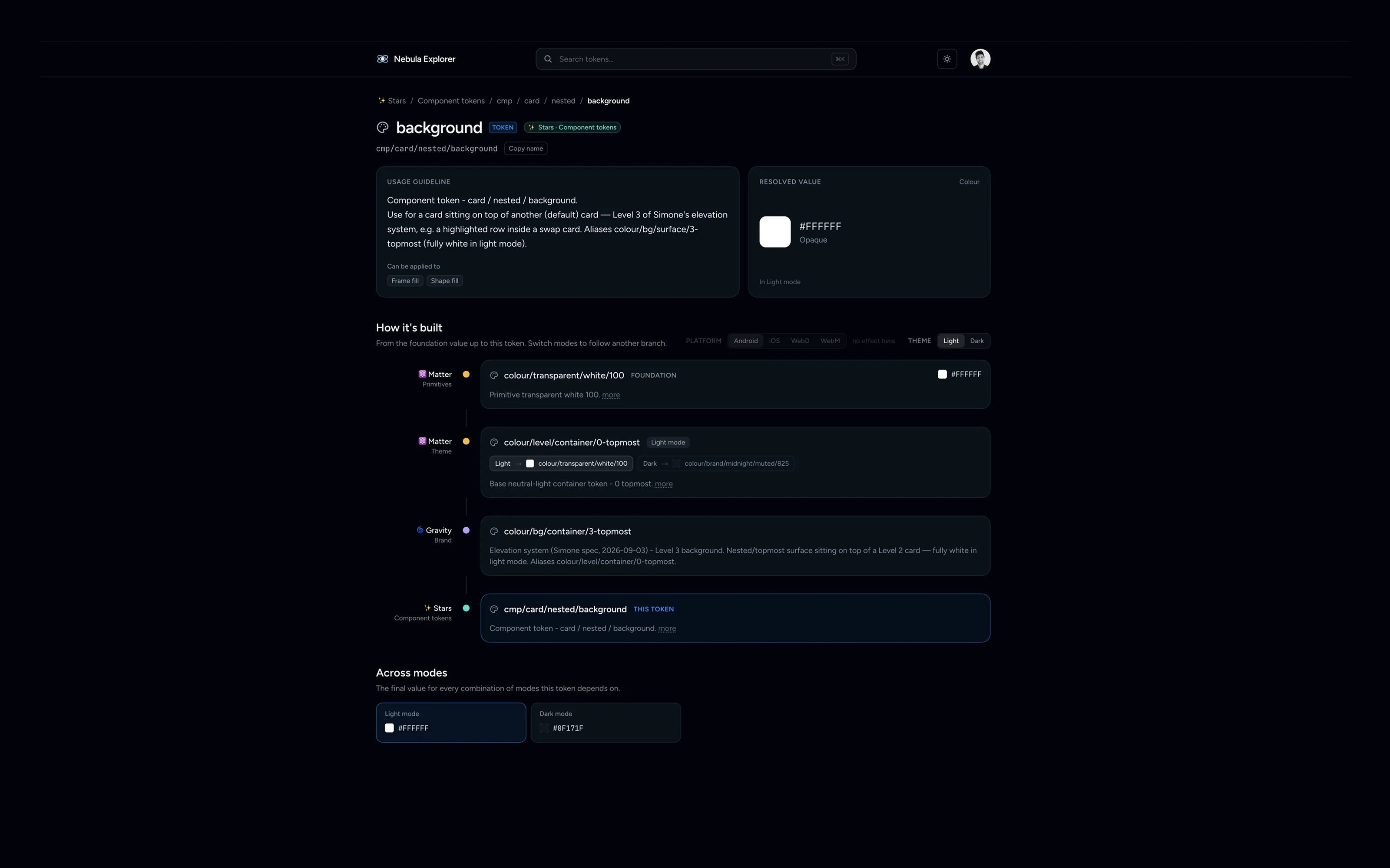
To stop them recurring I built the tooling covered in the Nebula Token Tooling case study: a Figma plugin for batch edits, a sync plugin, and the Explorer, where anyone can search a token and trace it from component back to primitive. The Explorer is live and the sync plugin is in the team's hands.
Key decisions
Decision
OKLCH vs HSL for colour tokens
- Why
- Lightness shifts look consistent across hues, so generated variants stay accessible. HSL shifts look uneven and produce contrast failures.
- What it cost
- Less familiar to the team; required education and tooling support.
Decision
Four-tier architecture vs a flat token list
- Why
- A flat list drifts because there is no defined place for a new token. A layered architecture gives every token a home, makes refactors safe, and lets tooling automate the chain.
- What it cost
- Upfront investment of 4,250 variables across three files, plus an ongoing audit burden.
Highlights
Outcome
- variables across three files
- 4,250
- component tokens
- 70
The Nebula is the source of truth for web and app at Kinesis. Any designer or engineer can trace a token from component to primitive in the Explorer. The audit found real violations and the clean-up is ongoing, but now they are visible and fixable, which the old system never allowed.
Learnings and what's next
I would start the audit sooner. The architecture was right from day one, but violations crept in during the early months because nothing was there to catch them. A system needs its enforcement tooling from the start.
Next for the Explorer: show where each token is used, flag violations automatically, and eventually create tokens from it with their code names, so a designer can change a token and see every affected component before shipping.