DesignShipped2022
Kinesis Exchange
Real-time trading of gold, silver and crypto, redesigned from discovery to production on web and mobile.
Redesigned and shipped the Exchange across web, iOS and Android.
Visit kinesis.money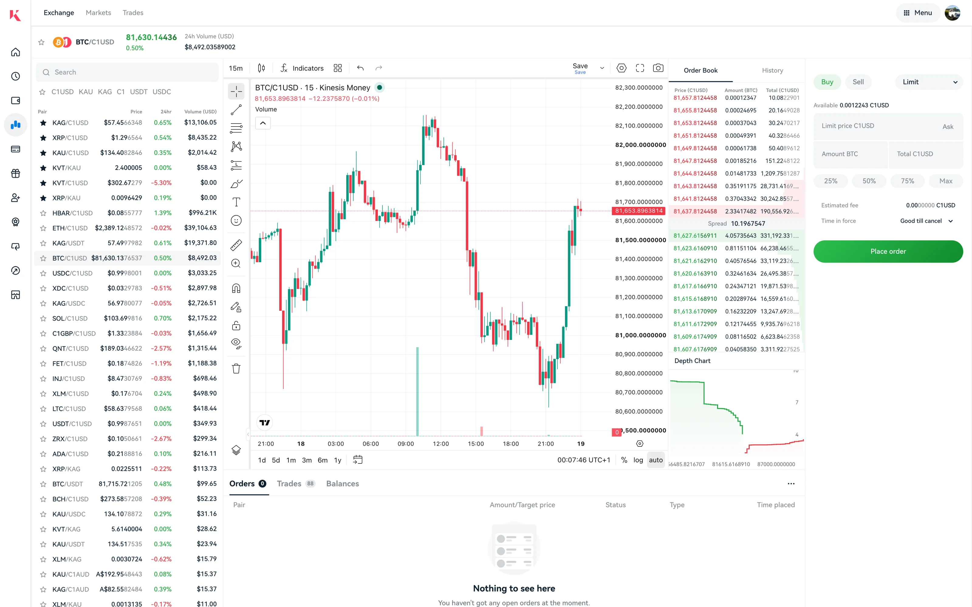
TL;DR
01 / What it is
The redesign of the Kinesis Exchange, where users trade gold, silver and crypto in real time, taken from research to production on web, iOS and Android.
02 / Why it existed
The old exchange was not built for the market depth, the number of pairs or the cross-platform consistency the platform had grown into.
03 / What I achieved
Shipped across all three platforms, including a Watchlist and Alerts system I split apart so alerts stopped being noise.
Overview
The Exchange is the trading core of Kinesis Money. People trade Kinesis gold (KAU) and silver (KAG), bitcoin and other crypto against Kinesis fiat-backed currencies like C1USD, in real time. I led the redesign from research and information architecture through interaction design to release on web, iOS and Android. The trading view brings together a market list grouped by quote currency, a live chart, the order book with its spread and depth, and an order form that covers every order type and state. Alongside it sits the Watchlist and Alerts system I redesigned.
Why it existed
Kinesis manages billions in client precious metals, and the exchange is how people buy, sell and move between metals, crypto and fiat-backed currencies. The old exchange worked, but it had not kept up with the market depth, the range of pairs or the need to behave the same on web and mobile. The redesign had to handle real-time trading with the care a regulated product needs, and feel like one product on all three platforms.
My role
Lead UX/UI designer. I ran discovery, including user research and a competitive look at Coinbase and Kraken, defined the information architecture and interaction design, and owned the designs through to release. The Watchlist and Alerts system, and the decision to decouple them, is mine.
Approach
Design
Design
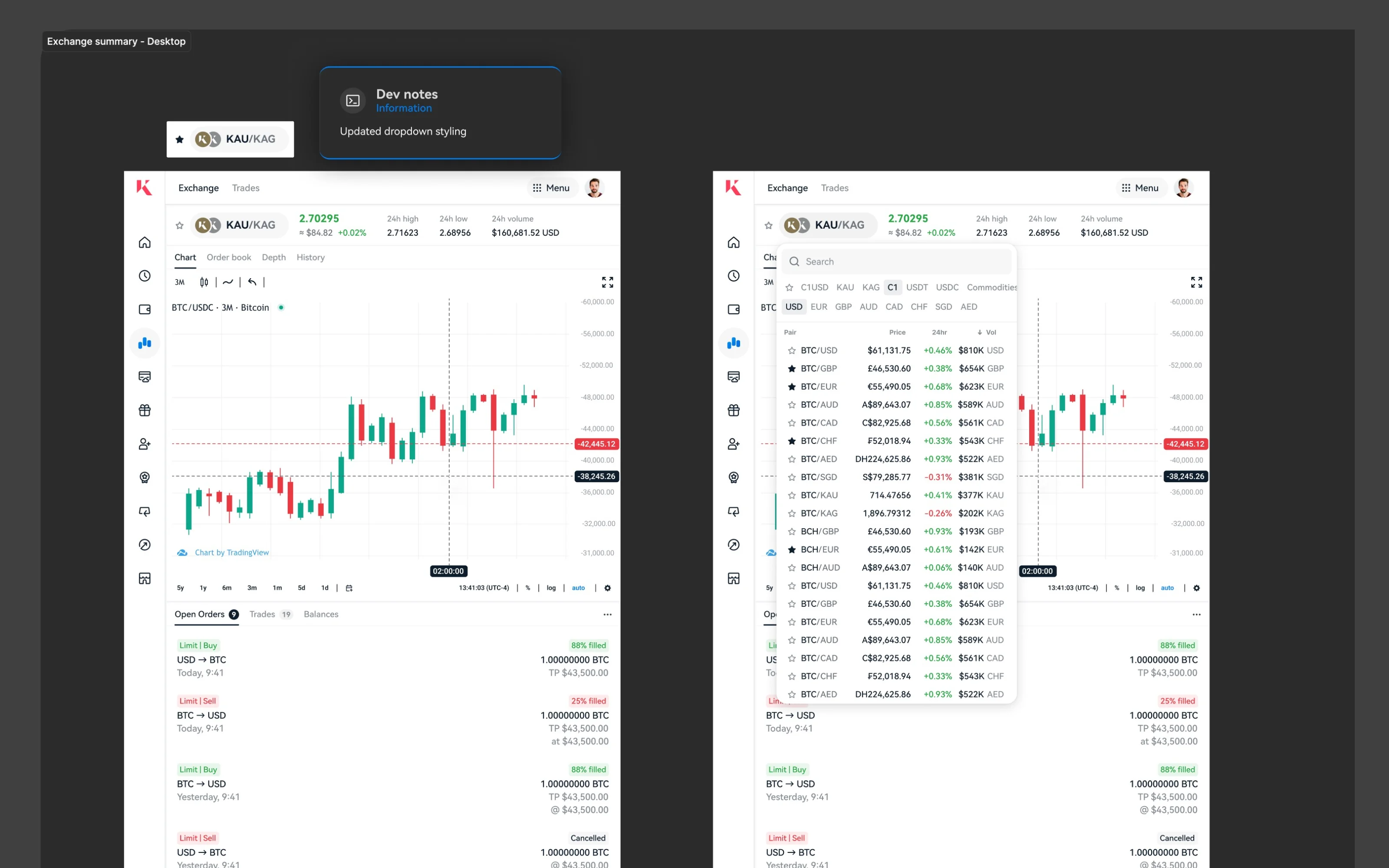
The exchange has three core surfaces: the trading view (market list, live chart, order book and depth, order form), the markets overview for browsing every pair by metal, crypto or currency, and the Watchlist and Alerts system.
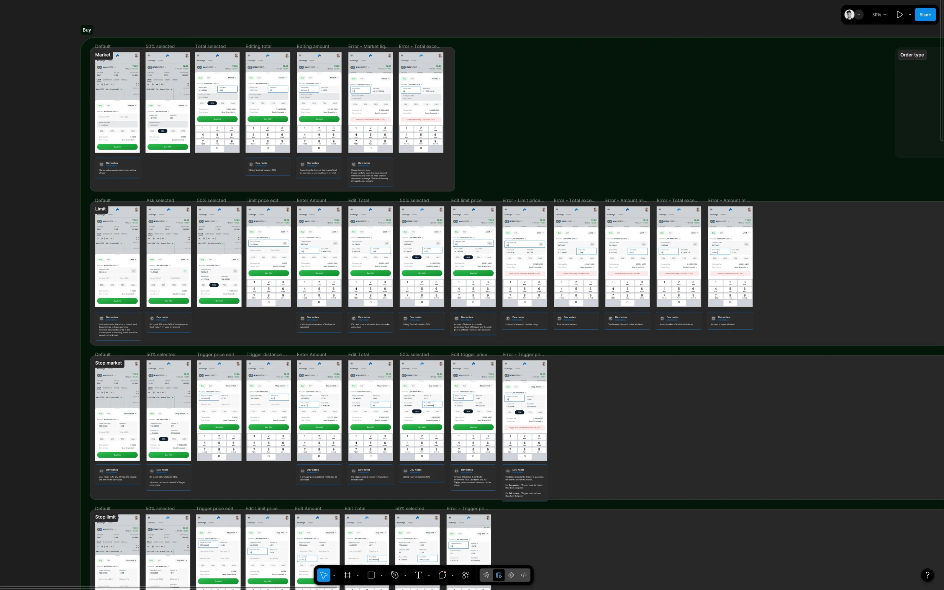
The trading view was the design-intensive piece. Real-time price data is noisy, and the design had to make it legible without dumbing it down. I studied Coinbase for its clarity with new traders and Kraken for its depth of market data, and positioned the Kinesis Exchange between them: approachable enough for a first-time metals buyer, deep enough for an active trader. The order form shows the available balance, percentage presets, the estimated fee and the time in force before the user commits, so the cost of an order is never a surprise.
Decoupling the Watchlist from Alerts was the key decision. The earlier model coupled them: watching an asset implied alerting on it, and vice versa. That was wrong for the mental model. A user watches assets they are interested in, which is passive, and sets alerts at specific thresholds, which is active. Coupling them meant every watch generated noise and every alert forced a watch. I separated them into two features with their own entry points and state models, and set the rule of one alert per asset to prevent alert spam.
Key decisions
Decision
Decouple Watchlist from Alerts
- Why
- Watching an asset is passive monitoring; alerting is active notification. They serve different intents and have different state models. Decoupling lets the user watch broadly and alert precisely.
- What it cost
- Two features to design, build and maintain instead of one.
Decision
Position between Coinbase and Kraken
- Why
- Kinesis serves both first-time metals buyers and active traders. An exchange that is only approachable loses the trader; one that is only deep intimidates the newcomer. It had to be legible at first glance and deep on inspection.
- What it cost
- More design complexity; two user types to serve in one surface.
Highlights
Outcome
The redesigned Exchange is live on web, iOS and Android, and it is what users trade on today. Splitting the Watchlist from Alerts removed a real annoyance: alerts you never asked for, and watches you had to keep just to get alerted.
Learnings and what's next
A trading screen is a density problem. Prices, the order book, depth and your own positions all want the same space. The job is to show the right thing at the right moment and let people dig deeper when they choose. Density is fine when every element earns its place.
Next: the App 3.0 redesign of the exchange for mobile, on the Nebula token system with the new navigation.