DesignLive2026
Edgeways Design System
A documented, componentised design system for a live betting-maths product.
Enforced by a review agent, not by hand; shipped across six versions with paying users.
Live at edgeways.app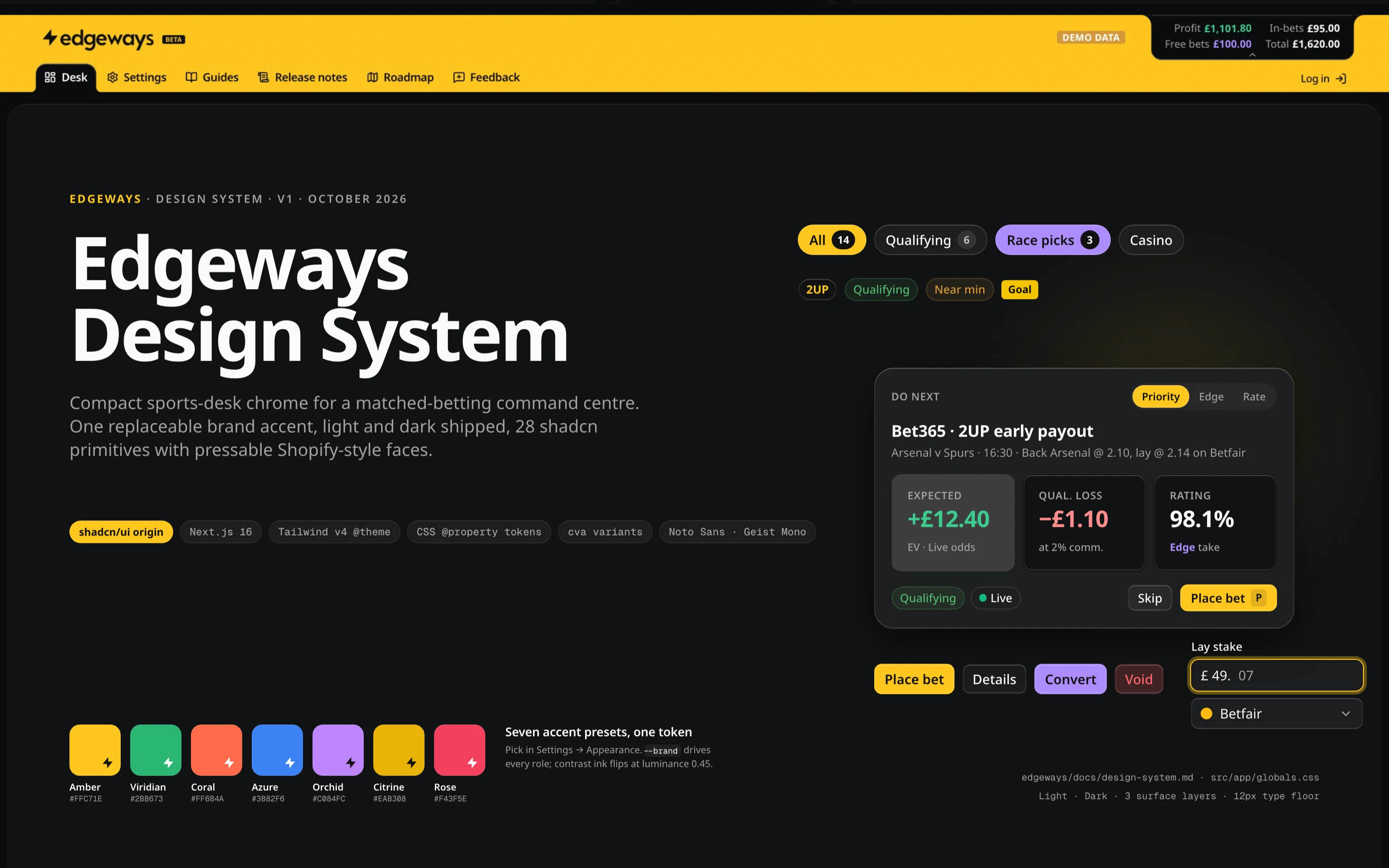
TL;DR
01 / What it is
The design system behind Edgeways: compact, dense and unambiguous about money.
02 / Why it existed
Betting decisions happen in seconds and involve real money. The UI had to be fast to read and impossible to misread.
03 / What I achieved
A documented, componentised system enforced by a review agent, shipped across six versions in eight weeks.
Overview
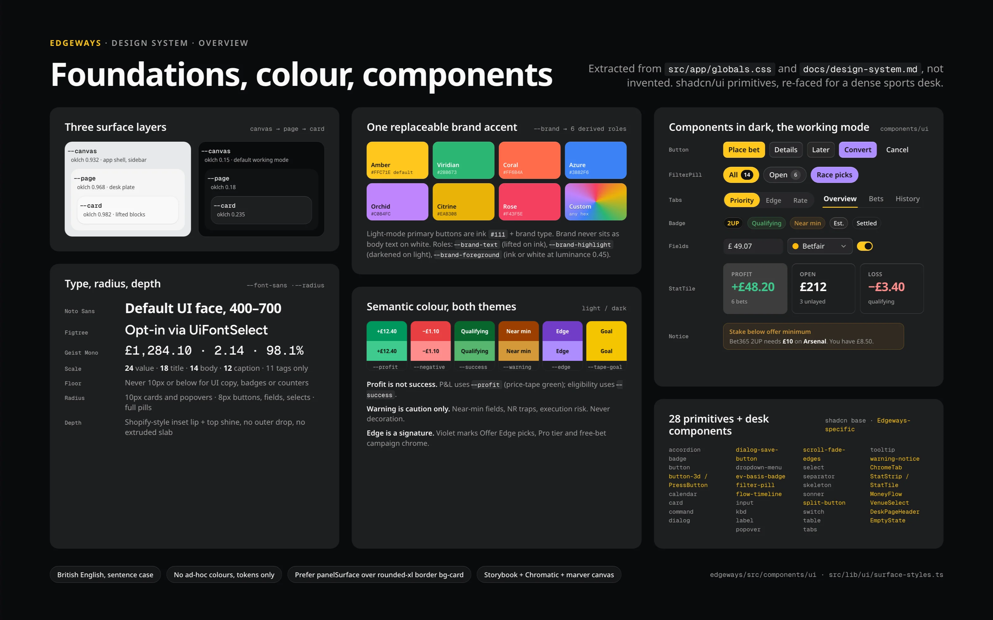
This is the visual and component system behind Edgeways. The look is compact sports-desk chrome: neutral greys, one replaceable brand accent, and green and red that always mean profit and loss. Everything is componentised in shadcn and Tailwind, documented in the repo, and works in light and dark across four platform modes.
Why it existed
An offer expires, odds move, and the user has seconds to decide whether to lay. The UI had to be dense without being noisy, and money states could never be ambiguous: green is profit, red is loss, nothing in between. The discovery tools look like catalogues. Edgeways needed to look like a command centre.
My role
I designed and built the whole system solo: the colour tokens, the profit and loss states, the patterns for filtering, switching modes, navigation and dense metrics, the type scale, and the rule that keeps the brand accent readable whatever colour a user picks. I also wrote the documentation the review agent checks against.
Approach
Design
Design
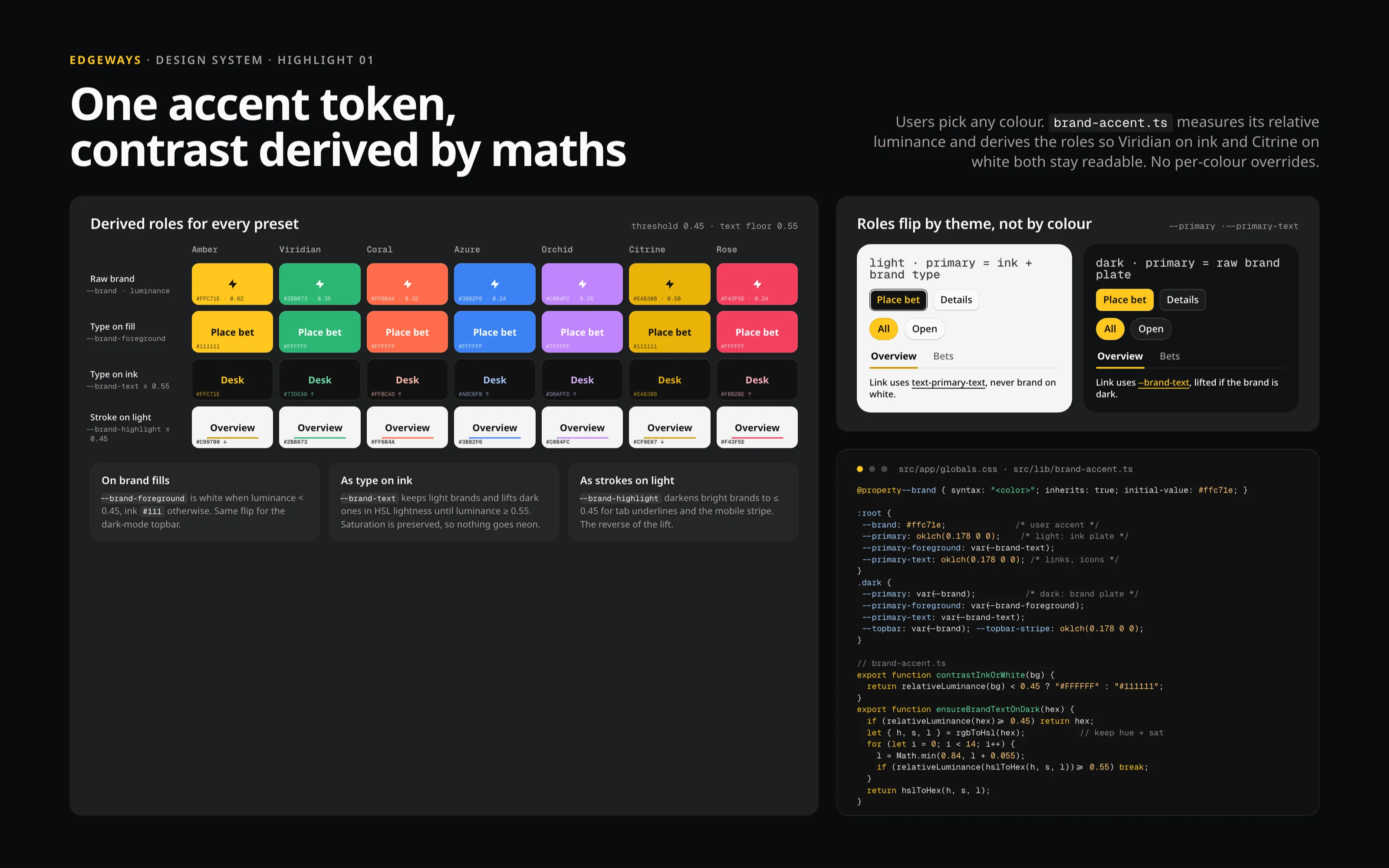
The system is built on OKLCH-derived tokens, the same principle as the Nebula. The palette is neutral greys with a replaceable brand accent; the default is amber, but the accent can swap without touching component logic. Profit and loss colours are semantic: green and red, always, with contrast checked by maths across light, dark and the four platform modes.
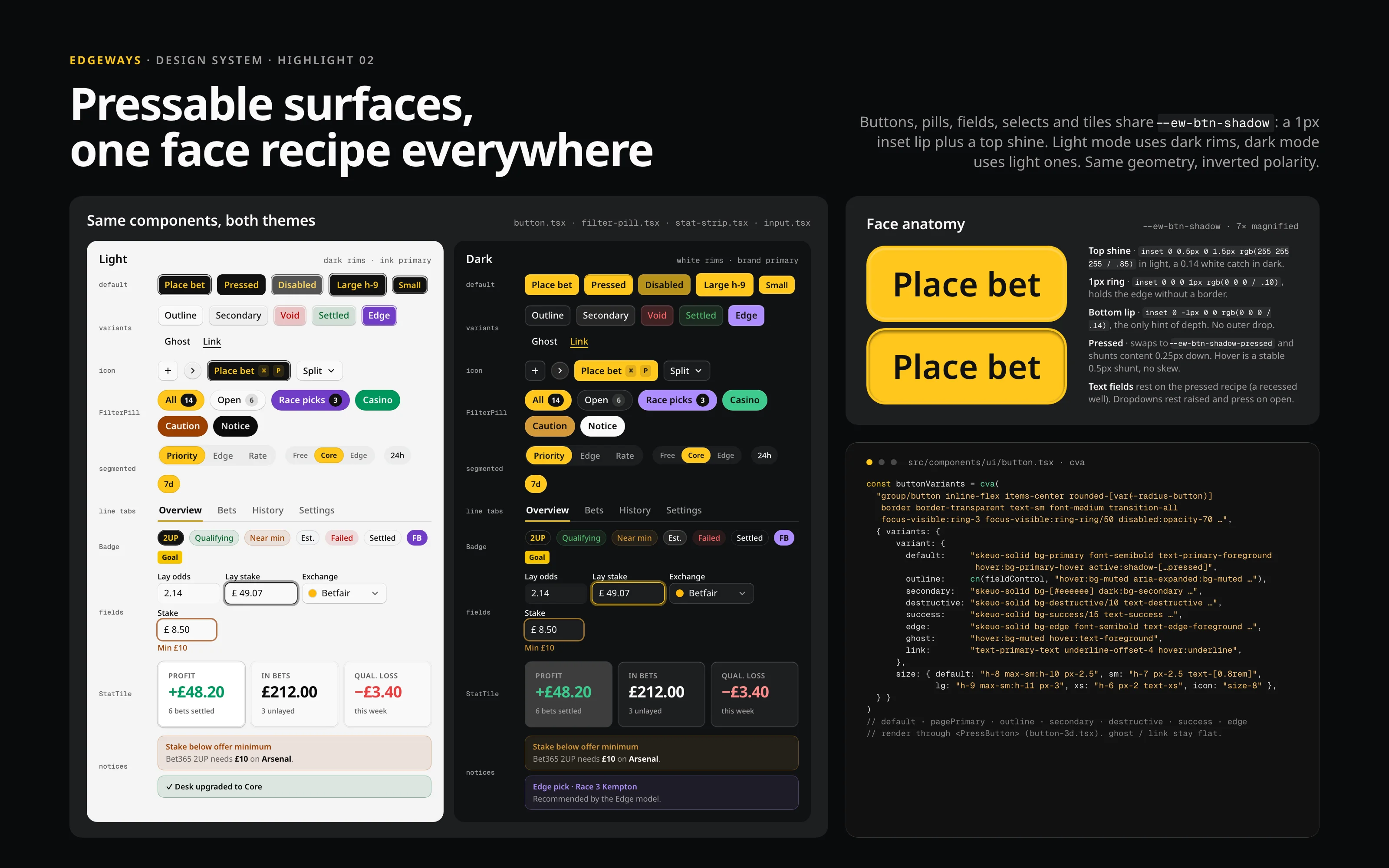
Components follow the Polaris tradition: pressable buttons that feel physical, pills for quick filtering, tabs for switching modes, a top bar for navigation and stat strips for dense metrics. The type scale has a floor, because betting data must be readable at a glance.
Engineering
Engineering
The system is fully componentised in shadcn and Tailwind. Every component, token and pattern is specified in the repo, and a review agent checks pull requests against that spec before merge, so the system is enforced by a gate rather than by my memory.
Platform modes are engineered, not designed around. Each platform gets its own mode mapping, and the OKLCH tokens generate the variants automatically, with no manual dark-mode pass per platform.
Key decisions
Decision
Semantic money colours vs neutral data display
- Why
- In a money-sensitive product, ambiguous colour is a bug. Green means profit, red means loss, always. The user should never have to think about what a colour means.
- What it cost
- Less flexibility for theming; the money colours are fixed.
Decision
Replaceable brand accent vs fixed palette
- Why
- The OKLCH token architecture lets the accent swap by changing one variable. If Edgeways ever white-labels or rebrands, the system adapts without a refactor.
- What it cost
- Slightly more upfront token complexity.
Highlights
Outcome
Six versions in eight weeks, enforced by a review agent rather than by me remembering the rules. Light, dark and four platforms come from one OKLCH token set, and the money states have not produced a misread in production.
Learnings and what's next
I would write the rules down from version one. The early versions had rules that lived in my head; putting them in the repo and wiring them to an automated gate is what let the system outgrow one person. A design system is the enforcement, not the tokens.
Next: extend the system to the accumulator desk and a variance simulator, which need data-visualisation patterns the kit does not have yet.